In my last post, I showed the various layout alternatives of the news teaser webpart. In this post, I am experimenting with variantions of the News teaser Webpart and the hero teaser Webpart.
Variation 1:
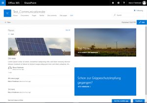
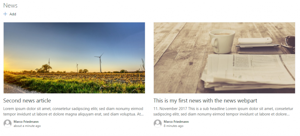
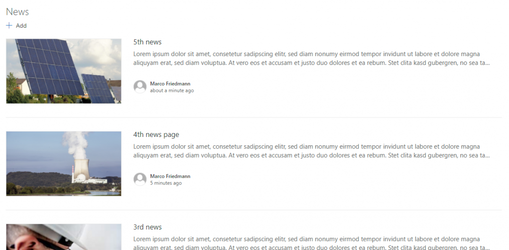
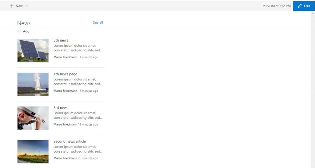
Here I use a two column layout. In the left column I use the news webpart with top story layout and in the right column two hero teaser webparts on top of each other.
Variation 2:
This time I use two rows. In the first row the news webpart (top story) and below a 3 column layout with a hero teaser webpart in each colum. You could also put more than one tile in the webpart and use it as a carousel.
Variation 3:
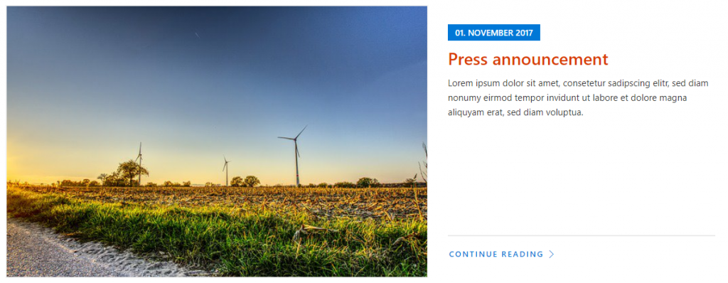
Also two rows. This time with a hero teaser webpart at the top (one time in layer layout and one time in tile layout) and the news teaser webpart below.

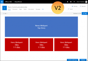
Variation 4:
Almost the same as variation 3, this time with two tiles in the top row.
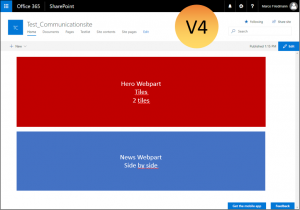
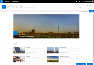
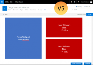
Variation 5:
This time I use a two column layout again with the News webpart to the left, this time side by side and on the right two hero teaser webparts on top of each other.
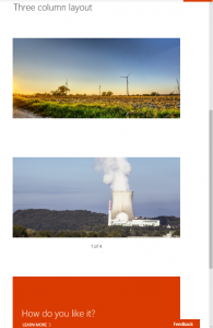
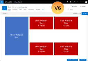
Variation 6:
And as last variation a three column layout. In the first column I use the News webpart in list layout and in the other layouts the hero webpart.
Conclusion
With the modern pages, the biggest challenge seems to be to choose a good combination of column layouts and webparts. What are your best combinations and goot practices?

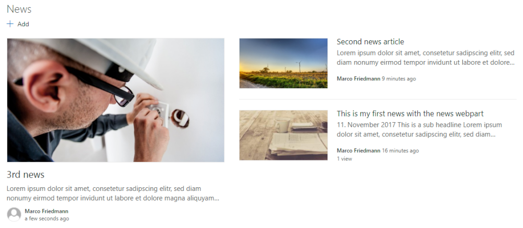
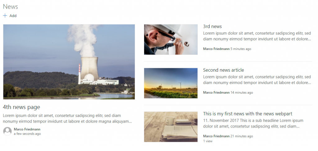
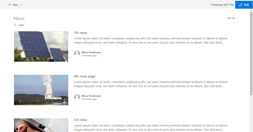
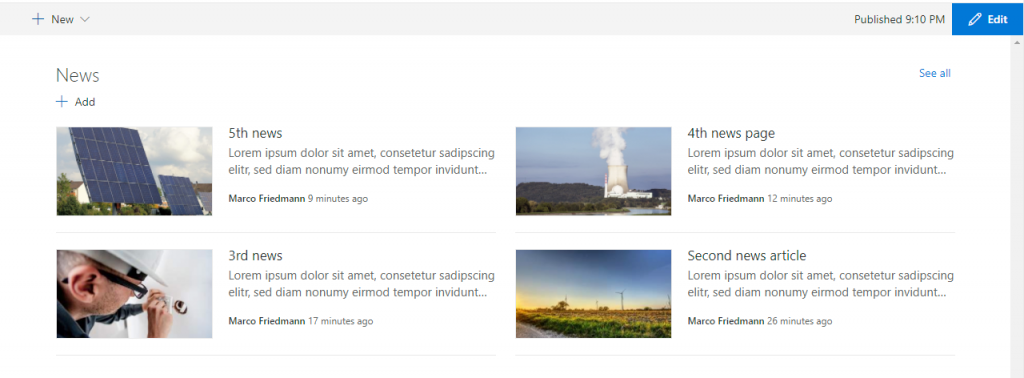

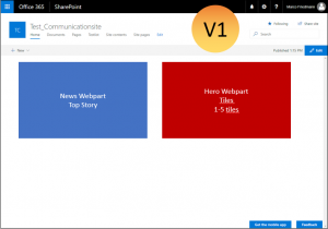
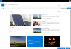
 The rendering seems to be the same as in the two column layout. But if you include the same webpart in another column, it is rendered differently:
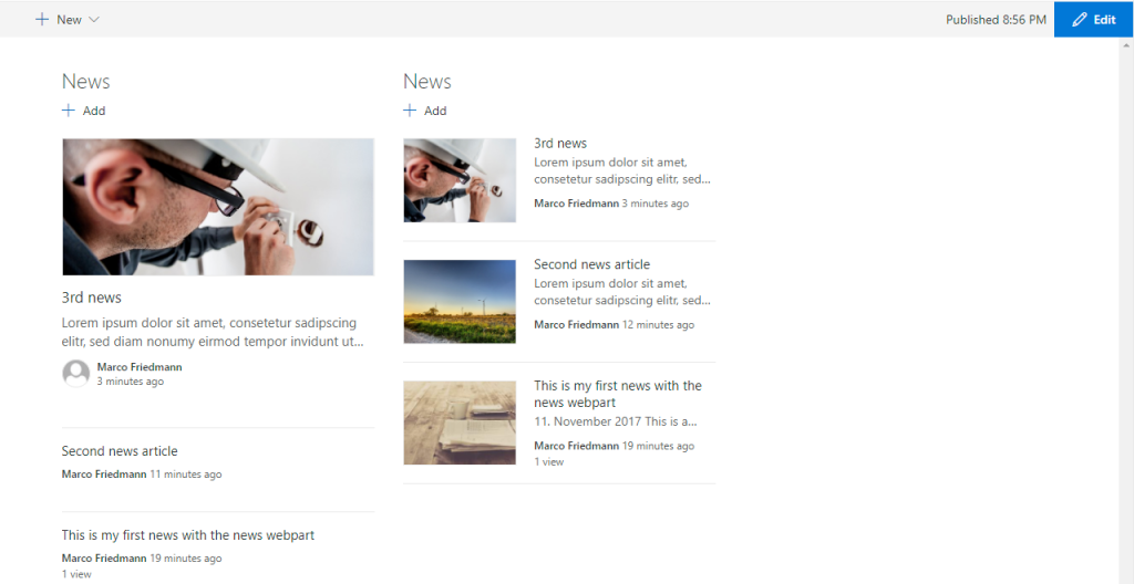


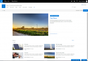
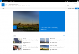
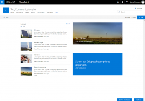
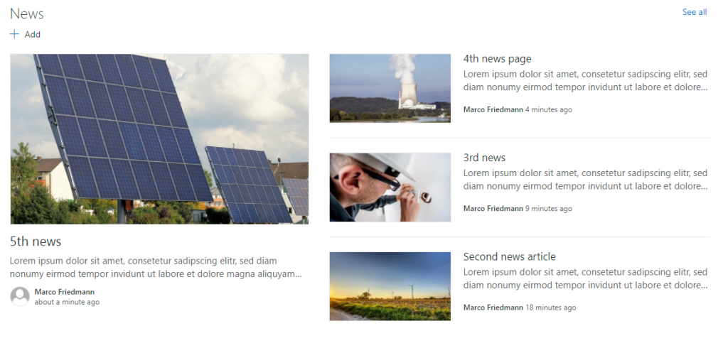
 The Version on smaller devices is looking ok: