In this post, I want to show and discuss the many possibilities of the hero teaser web part:
General Features
The hero teaser Comes in two layout options, tiles and layers. In this post, I will only cover tiles. You can choose up to five tiles.
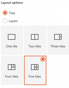
Each tile consists of the following elements:
- link
- title (optional)
- image or colored box
- call to action link (optional)
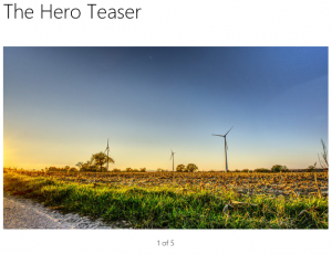
One column layout
In the one column layout, the teaser looks like this:

Due to ist responsive layout, the teaser changes to a carousel in Screens with less width:
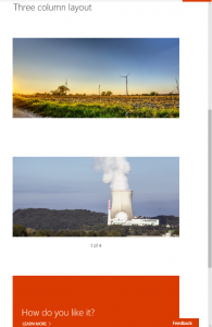
This responsive behaviour gives us the possibility, to use this in two or three column Layouts.
Two column layout
In the two column layout, the pictures get a stretched look, but still ok.

Or even three columns
With three columns, it is looking good again.
 The Version on smaller devices is looking ok:
Conclusion
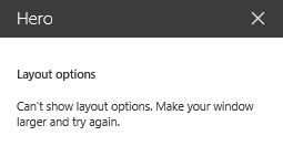
The hero teaser webpart offers some interesting variations für creating good looking pages. At the moment, I see problems concerning the white space between the web parts and some issues with the property pane:
Your ideas about the hero teaser webpart?
In the next post I speak about the differences between tiles and layer versions.