In my last post, I showed the various layout alternatives of the news teaser webpart. In this post, I am experimenting with variantions of the News teaser Webpart and the hero teaser Webpart.
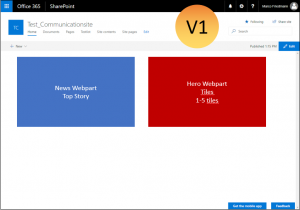
Variation 1:
Here I use a two column layout. In the left column I use the news webpart with top story layout and in the right column two hero teaser webparts on top of each other.
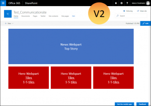
Variation 2:
This time I use two rows. In the first row the news webpart (top story) and below a 3 column layout with a hero teaser webpart in each colum. You could also put more than one tile in the webpart and use it as a carousel.
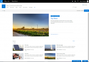
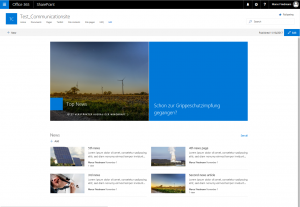
Variation 3:
Also two rows. This time with a hero teaser webpart at the top (one time in layer layout and one time in tile layout) and the news teaser webpart below.

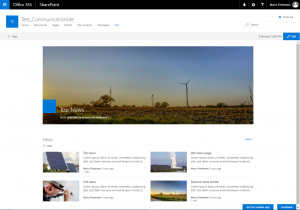
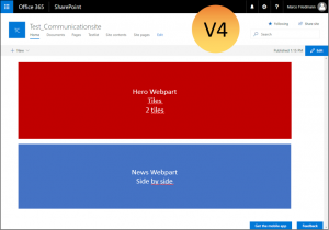
Variation 4:
Almost the same as variation 3, this time with two tiles in the top row.
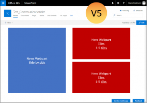
Variation 5:
This time I use a two column layout again with the News webpart to the left, this time side by side and on the right two hero teaser webparts on top of each other.
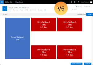
Variation 6:
And as last variation a three column layout. In the first column I use the News webpart in list layout and in the other layouts the hero webpart.
Conclusion
With the modern pages, the biggest challenge seems to be to choose a good combination of column layouts and webparts. What are your best combinations and goot practices?